One product photo, four ratios: framing it so nothing gets cut off
By SemPost EditorialWritten with AI, read by an editor
Published 11 min read
In this article
Why one picture breaks on the way to four networks
You shot a good photo of your best-selling mug. It looks great on your product page. Then you post it and the trouble starts.
On one network it appears as a tall full-screen vertical. On another it is a portrait card in the feed. A third shows a square, and a fourth, or a link preview, shows a wide landscape strip. Each placement has its own shape, and the shape decides what the viewer sees.
When a crop happens automatically, or in a hurry, the software does not know what matters in your picture. It keeps the middle and removes the rest. That is how you end up with:
- a handle sliced off the mug,
- a logo half outside the frame,
- a "New" or price badge pushed against the edge or cut in two,
- a product that looks fine in the feed but loses its edges when someone taps through to a bigger view.
Many shops respond by re-shooting or re-editing the picture for every network. It works, but it is slow, and the four versions drift apart in color, lighting and style.
The fix happens before the crop. Frame the picture once with all the final crops in mind, then cut it the same way every time. This article gives you a method for that: one master image, four crops, and a checklist anyone on the team can follow today.
The four ratios in plain terms
A ratio is just the shape of the frame: width compared with height. You do not need pixel sizes to plan a crop. You need to know which shape suits which placement and what each shape tends to cost you.
| Ratio | Shape | Usually used for | What usually gets lost |
|---|---|---|---|
| 9:16 | Tall vertical | Full-screen vertical video and stories-style placements | The sides, when cut from a wider picture. Interface elements also cover parts of the top and bottom. |
| 4:5 | Portrait | Tall feed posts, where a portrait takes up more screen than a square | Little from a tall picture; the top and bottom from a wide one |
| 1:1 | Square | A safe middle option that works in many feeds and grids | Some top and bottom from a portrait picture, some sides from a landscape one |
| 16:9 | Wide landscape | Video players, link previews and desktop viewing | A lot of the top and bottom when cut from any tall picture |
Two points about this table:
- It describes general use, not rules. Networks change which ratios they recommend and which placements they offer. Before you lock in your process, check each network's own help page: Instagram, TikTok, Pinterest, Facebook and YouTube. Pinterest, for example, has leaned toward tall images, so look up its current recommendation. Treat anything you read there as true "as of November 2026" and recheck it from time to time.
- The order of difficulty matters. Cutting a wide picture down to a tall one, or a tall picture down to a wide one, removes the most. That is why one frame rarely covers every ratio without planning.
Note
This article deliberately avoids pixel sizes, file limits and video lengths. Those numbers change, and a repeatable method matters more than any single figure. Use the help pages above for the current numbers.
Build a safe-zone master
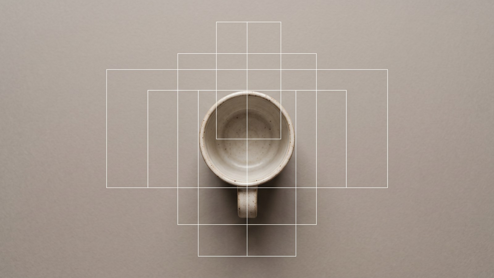
The safe-zone master is a single picture with extra room around the product. Think of it as a generous canvas that you trim down afterwards. Trimming is easy. Adding missing background is harder.
Step 1: Shoot or generate wider than you need
Place the product in the center, with roughly the same space on all sides. Resist the urge to fill the frame. Empty background is not wasted. It is the material your crops will use.
Step 2: Define the core zone
The core zone is the smallest area that must survive every crop. It includes:
- the whole product, with a little breathing room,
- the logo or label, if it matters for recognition,
- any text or badge you plan to add.
Sketch it as a rectangle in the center of the master. Everything inside it is protected. Everything outside it is expendable.
Step 3: Choose the master's shape honestly
Ideally the master is tall enough for 9:16 and wide enough for 16:9. In practice one frame rarely covers both. A frame that is very tall gives you a good vertical but a thin landscape strip. A very wide frame does the opposite.
So make a trade-off:
- Look at where you post most. If most of your posts are feed portraits and verticals, make a 4:5 master.
- Plan the least-used ratio with extra background, added later (see the next section), instead of trying to make one frame do everything.
A worked example with simple arithmetic
Say your master is 4:5. For easy math, imagine it is 1,000 units wide and 1,250 units tall. These are made-up units, not pixels, and the proportions are what matter.
- 4:5 itself: keep everything. This is your base.
- 1:1 crop: the square keeps the full width of 1,000 units and needs 1,000 units of height. You lose 250 of 1,250, which is 20% of the height.
- 9:16 crop: the tall vertical keeps the full height of 1,250 units. To be 9:16 its width is 1,250 × 9 ÷ 16, about 703 units. You keep roughly 70% of the width and lose about 30%.
- 16:9 crop: the landscape keeps the full width of 1,000 units and its height is 1,000 × 9 ÷ 16, about 563 units. You keep only about 45% of the height.
Now find where the core zone must sit. If both the square and the vertical are cut from the center, the part that survives both is about 703 units wide and 1,000 units tall, which is roughly 70% of the master's width and 80% of its height. That is your safe rectangle for those three ratios.
For 16:9 the safe rectangle shrinks to about 70% wide and 45% tall. A wide, low product such as a mug or a pair of shoes may fit. A tall bottle or a standing lamp will not. For a product like that, do not squeeze it. Extend the background sideways to make a wider canvas, as described below.
| Crop from the 4:5 master | Keeps | Core zone must fit within |
|---|---|---|
| 1:1 | Full width, 80% of height | 80% of the height |
| 9:16 | 70% of width, full height | 70% of the width |
| 1:1 and 9:16 together | 70% of width, 80% of height | The central 70% × 80% |
| 16:9 | Full width, 45% of height | The central 45% of the height |
Tip
Mark the core zone on the master as a rectangle in your editor, or just keep a note of its proportions. If the product does not fit inside the smallest safe rectangle you need, change the picture, not the product's size.
Crop each ratio without losing the product
Once the master exists, each crop follows the same recipe: place the crop box, trim empty background first, and never trim the product's edge or label.
9:16 (tall vertical). Center the crop box on the core zone. Trim the left and right background. If the product is wide, scale the box down rather than cutting into the product. Keep any text in the middle of the frame, because networks draw buttons, captions and profile names over parts of vertical placements.
4:5 (portrait). This is usually your master, so little needs to be trimmed. Remove only stray background at the edges. Leave a visible margin around the product.
1:1 (square). Keep the full width and trim equal amounts from the top and bottom. If the product sits slightly low or high in the frame, shift the box toward it.
16:9 (landscape). This is the crop that takes the most away. Keep the full width, then slide the box up or down until the whole core zone sits inside. If it does not fit, the master needs more background on the sides. Do not squash the product to make it fit.
Keep text and badges inside the core zone
Text and badges placed near the edges are the first things to disappear. They are also the likeliest to run under the interface. Keep them inside the core zone. Then preview the post in the network's own app before it goes out. Each network's help page, linked in the previous section, describes the areas its interface covers, so check it for the current overlay areas.
When a crop does not work, extend the background
If the product is too tight in one ratio, do not squash it and do not accept a cut-off edge. Extend the background instead. In the SemPost Studio you can edit a picture or build a new scene around your product, and you can rewrite the text or make a new image when you want a fresh version with more space.
If you ask an AI image model for a new scene, tell it to leave room. Here is an example prompt:
A ceramic mug on a plain warm-grey surface, soft daylight, shot from slightly above.
The mug is small in the frame and centered, with a large amount of empty, evenly lit
background on all four sides, so the picture can be cropped to tall, portrait, square
or wide shapes without cutting off the mug. No text, no logos, no people.
Notice what the prompt does and does not do. It asks for generous, plain space on all sides, and it contains no brand names and no claims about the product.
Video and motion: the same rule, one more step
The method carries over to video. Film or generate in the largest frame you need, and keep the subject inside the core zone.
Video adds one complication: the crop applies to every frame, not just one. A subject that sits safely in the center in the first second may drift toward an edge when the camera moves or the product turns. Give moving subjects and camera moves extra margin, more than you would give a still photo.
Plan the order of work too. Wide-to-tall crops lose the most, so:
- Plan and frame the vertical version first.
- Derive the landscape version from it by extending the background or reframing, not by cropping a tall clip into a thin strip.
For how SemPost handles this, see the help pages on videos and motion clips and making a product video in the Video Studio. For vertical guidance and the parts of the screen the interface covers, check TikTok's help center. For how the player treats landscape and vertical video, check YouTube's help center.
Watch out
Do not judge a video crop from a single frame. Scrub through the whole clip in the cropped shape and watch the product's edges, the label and any text at the start, middle and end.
Checklist before you post
Copy this list into your team's notes and run it for every product picture.
- Core zone marked on the master (whole product, plus logo or label if it matters)
- Master has even space around the product, with the product centered
- All four crops exported: 9:16, 4:5, 1:1 and 16:9
- Product fully visible in each crop, with no cut edges
- Text and badges sit inside the core zone in every crop
- Ratio guidance checked on each network's help page
- Each post previewed in the network's own app
- Video clips scrubbed from start to end in each shape
- Files named by ratio and saved in the media library
- Alt text written for the picture
Name and store the four crops
Naming prevents the most common mistake, which is posting the wrong shape to the wrong network. Use one pattern and stick to it:
product-name_color_9x16.jpg
product-name_color_4x5.jpg
product-name_color_1x1.jpg
product-name_color_16x9.jpg
Write the ratio with an "x" instead of a colon, because many systems do not accept colons in file names. Upload the full set together so it stays together: see how to upload pictures and videos and how to keep them tidy in your media library. When you build a post, pick the file whose name matches the placement. The steps for writing and scheduling a post show where you attach it.
One last note
Ratio guidance changes over time. Networks add placements, retire others and adjust what they recommend, so the method here should outlast any single number. When in doubt, the networks' own help pages are the source of truth: Instagram, TikTok, Pinterest, Facebook and YouTube. Recheck them every few months and update your core zone if anything changes.